Case Study:
Dashboard – Fintech App
Simplifying Financial Tracking Through Intuitive, Real-Time Insights.
Overview:
The Personal Finance Dashboard was designed as the core screen of a Fintech app to help users manage and monitor their finances across income, expenses, savings, and transaction activity. The goal was to provide users with a responsive, intuitive, and visually engaging dashboard that brings clarity to their financial health at a glance.
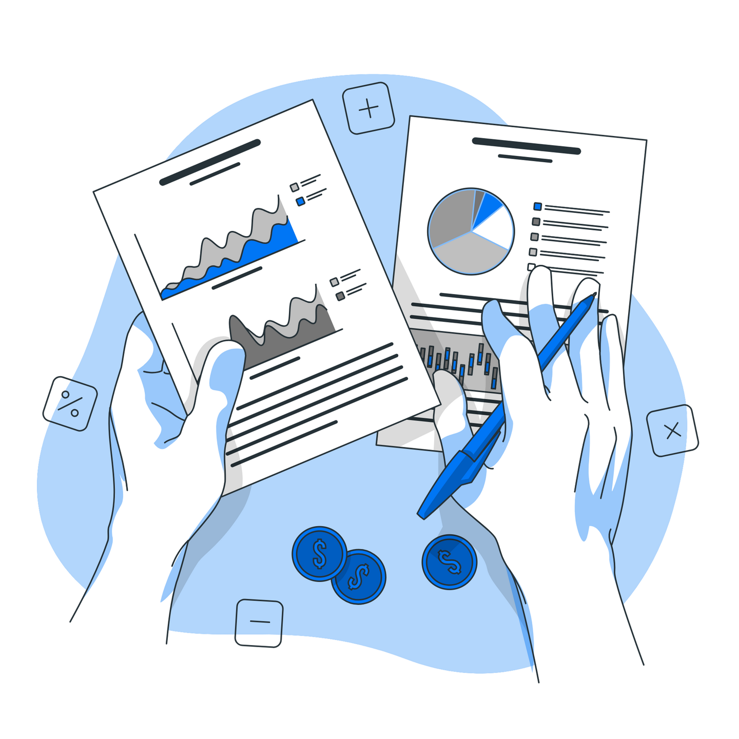
Final Design:
Problem Statement:
Before this dashboard was introduced, users of personal finance tools commonly faced:• Fragmented views of income, savings, and expenses.• A lack of real-time insights into spending behavior.• Overwhelming data presentation, especially on mobile.• No visual representation of financial trends or breakdowns.• Inflexibility to scale the dashboard to new metrics or widgets.
Key Objectives:
The key objectives of the fintech dashboard were:• Centralize Key Financial Metrics.• Ensure Responsive Design.• Promote Data Visualization.• Encourage Interaction.• Support Future Scalability.
Research & User Insights:
I reviewed popular personal finance apps and conducted informal interviews with users ranging from young professionals to retired individuals. Key findings included:• Users checked their financial dashboards daily and preferred clear visuals over spreadsheets.• Many users accessed financial apps exclusively on mobile and needed compact, scrollable designs.• Users wanted recent transactions front and center for spending awareness.
Collaboration:
The dashboard design was a collaborative effort involving:• Business Analysts who outlined core metrics and roadmap for widget extensibility.• Data analysts who defined backend data logic and syncing frequency.• Frontend developers who translated designs into responsive components.• My role as UI/UX designer focused on user flows, layout structure, visual clarity, and responsiveness.
Design Process:
a. Wireframing & Prototyping:• Designed wireframes for both desktop and mobile layouts.• Established visual hierarchy: cards on top, charts in the middle, and transactional detail at the bottom.• Created mid-fidelity prototypes to test layout adaptability and widget interaction.
b. UI/UX Design:• Developed a modular layout that adapts seamlessly between screen sizes.
• Implemented a card-based system for Total Income, Total Savings, and Total Expenses.• Designed a clean transactions table with date, category, and amount columns.• Used a donut chart to visualize activity categories (e.g., shopping, food, utilities).• Integrated a line chart to reflect savings progress over time.**• Established consistent color logic to signal income (blue), expenses (red), and neutral data (gray).• Ensured all elements are thumb-friendly and legible on small screens.
c. User Testing & Feedback:• Conducted usability tests with early adopters across desktop and mobile devices.
• Users appreciated the clarity of the dashboard and how quickly they could grasp their financial position.• Feedback led to fine-tuning spacing, mobile card stacking order, and the readability of line chart values.• Prioritized optimization of loading states and touch interactions for mobile responsiveness.


Impact & Results:
• Improved Engagement – Daily active usage increased due to centralized financial insights.• Enhanced Decision-Making – Users reported more confidence in tracking and adjusting spending.• Positive Mobile Feedback – Mobile-first users highlighted ease of use and visual clarity.• Reduced User Drop-off – Simpler navigation and responsive behavior led to longer session durations.• Scalable Foundation – Enabled the development team to plan additional widgets for debt tracking, budgeting, and goal setting.